Infographic: DoD Ate Everything 
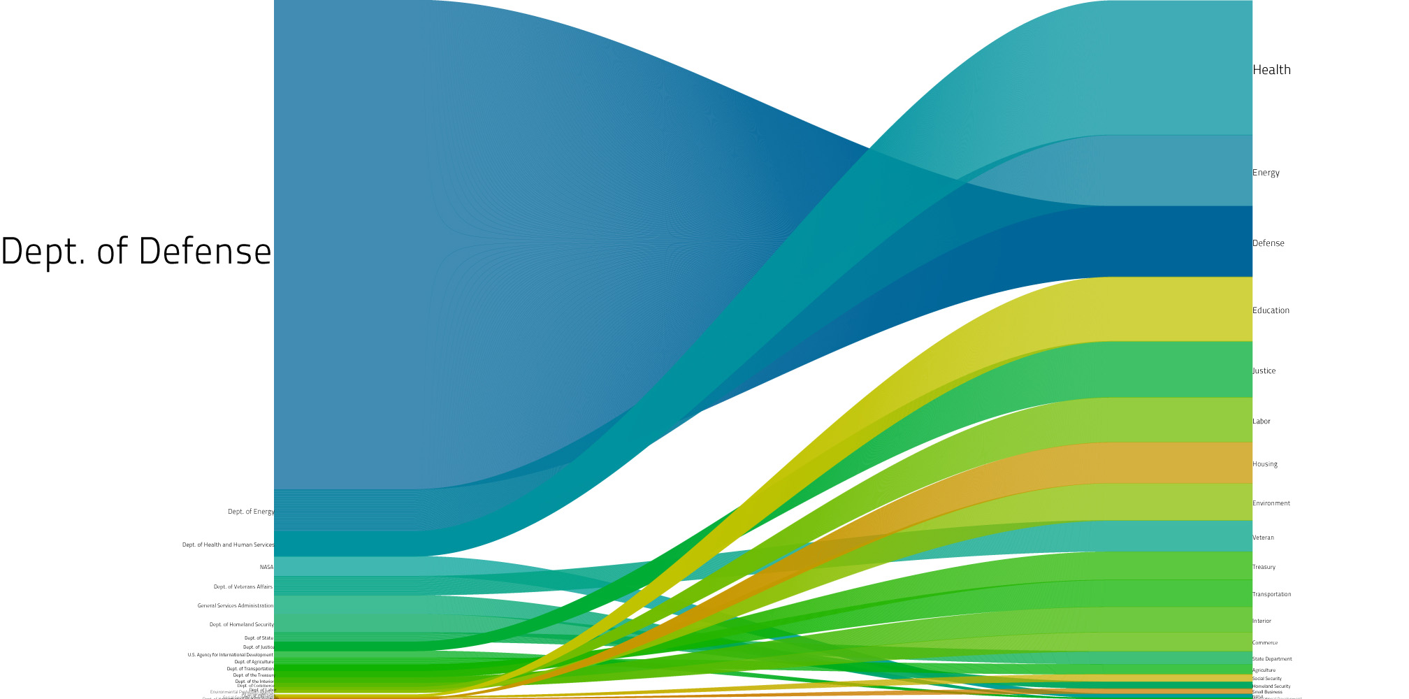
How skewed the federal budget really is: Sign up for my newsletter. Related posts: Infographic: Elections + Terror Alerts Solar At Grid Parity? Infographic: Communism and the Financial Crisis Robb on CNN Live FAMS Is Sick Tweet Like Posted in Infographic 2 Responses to “Infographic: DoD Ate Everything” Sky says: October 20, 2010 at 7:11 am Ok, pretty visualization, but I’m not following. Left-side appears to represent actual budget. Right-side is what? Assumed budget by citizens? Average budgets of other nations? what? Reply Shlok says: October 20, 2010 at 8:45 am Right side is media coverage of each relevant agency. Writeup. http://bit.ly/9JqQDf Reply Leave a Reply Click here to cancel reply. Name (required) Mail (will not be published) (required) Website
Ok, pretty visualization, but I’m not following. Left-side appears to represent actual budget. Right-side is what? Assumed budget by citizens? Average budgets of other nations? what?
Right side is media coverage of each relevant agency. Writeup. http://bit.ly/9JqQDf